10 Mind-Blowing Glassmorphism Examples For 2026
As a designer, I’m always for new trends and techniques to enhance my work.
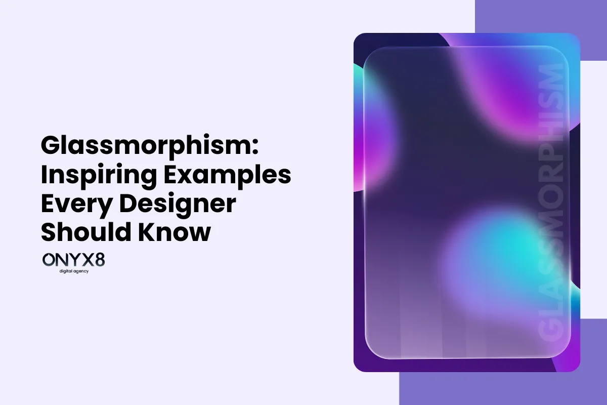
One design trend that has been gaining popularity in recent years is glassmorphism. It’s one of the current web design trends and uses translucent elements to give the illusion of glass.
As one of the top web design trends, glassmorphism will still remain trendy in 2026 as a visually striking approach that can add depth and elegance to any design.
Below, we will:
- Show ten inspiring examples (from different categories)
- Discuss some pros and cons of the trend
- See how to put in place glassmorphism in your design projects
- Explain the concept of glassmorphism.
10 Best Examples of Real Websites, Using Glassmorphism
Example 1. Weather App

The weather app uses glassmorphism using a frosted glass background.
On it are translucent cards with weather information. The blurred background adds depth, making the cards appear to float.
Take Tomorrow.io as one of the best glassmorphism examples:

The weather company showcases this impressive effect on their homepage and other pages, like the Weather API page here:

All in all, the frosted glass effect adds:
- A touch of elegance
- A sleek and modern layout
- A refreshed design.
Example 2. Music Industry (Players, Platforms, etc.)
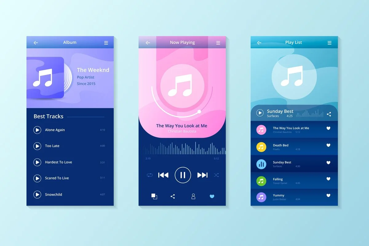
The music player interface adopts a glassmorphism style. Many companies use this approach today.
They use see-through buttons and a blurred background. The buttons have a glossy effect, mimicking the appearance of glass.
Take Spotify, for example.
With their “Spotify Wrapped” they create quite remarkable user experience. Its interactive music stats use a glass-like, icy background for overlays and UI cards.

This makes users’ experience visually engaging while keeping the focus on album covers and stats.
With the help of glassmorphism UI design, companies in the music industry:
- Create a sense of depth and interactivity
- Exude sophistication
- Create a better user experience
Example 3. Finance Dashboard
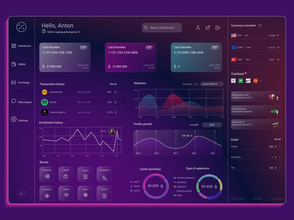
The finance dashboard uses glassmorphism by employing translucent charts and graphs.
The frosted glass effect exemplifies the fusion of functionality and style. Transparent panes overlay financial data, creating a visual balance in the platform design.
Eventually, arranging elements properly on the page is one of the web design principles.
Here are a few elements you can use in your financial dashboard, as an inspiration for 2026:
![10 Mind-Blowing Glassmorphism Examples For 2026 Glassmorphism example 2026 [Elements]](https://onyx8agency.com/wp-content/uploads/2024/05/Glassmorphism-example-2026-Elements.webp)
Above all, the subtle blur effect adds depth, making key metrics and graphs pop.
This design:
- Increases user interface
- Enhances data visualization
- Improves functionality of the interface
Example 4. Calendar Widget
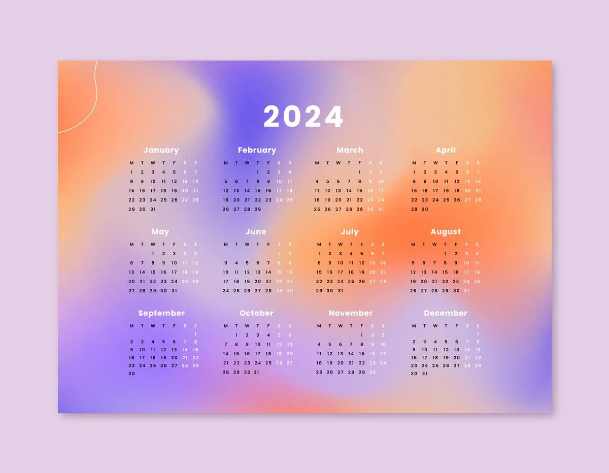
Translucent cells and a blurred background can be used for calendar widgets. The frosted glass effect adds elegance and makes the widget attractive.
The Calendar Widget transforms mundane scheduling into an attractive user experience. The glassy background helps show events and dates, making them easier to read and more beautiful.
One of the top glassmorphism design examples here is Apple macOS Big Sur Calendar:

Apple’s macOS Calendar widget is a brilliant example of glassmorphism usage. Soft-blurred panels provide a modern scheduling interface – and that blends pretty well with macOS’s UI.
This design choice:
- Enhanced readability
- Modern aesthetics
- Improved interactivity
Example 5. Mobile or Web Appa in Crypto/Stock Market
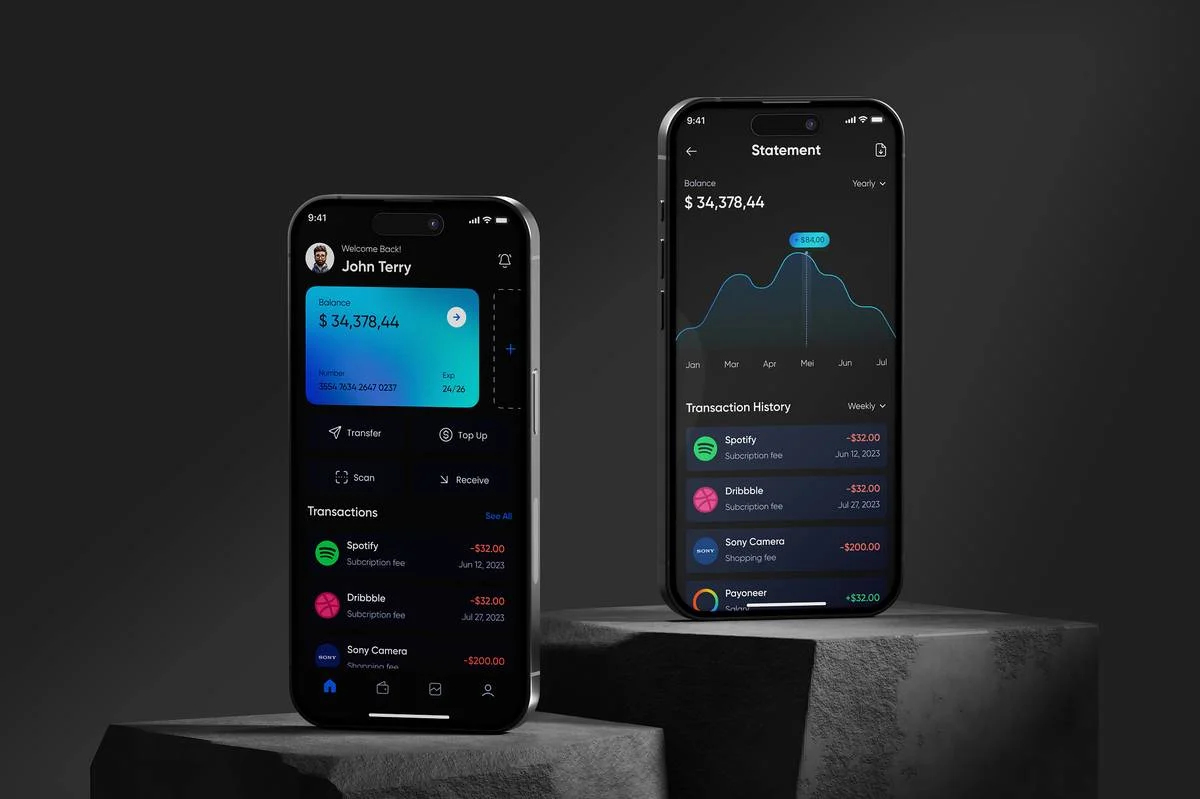
Glassmorphic design creates a dynamic, engaging UX.
Transparent overlays on market data and charts. You’ll meet this in stock market mobile apps. Especially when using crypto or stock apps.
In mobile apps, this approach:
- Enhanced absorption of complex financial data
- Improves the usability of the mobile App
- Creates a visually modern and sleek interface
You may also like: How Web Design Impacts Content Marketing
Example 6. Login Forms
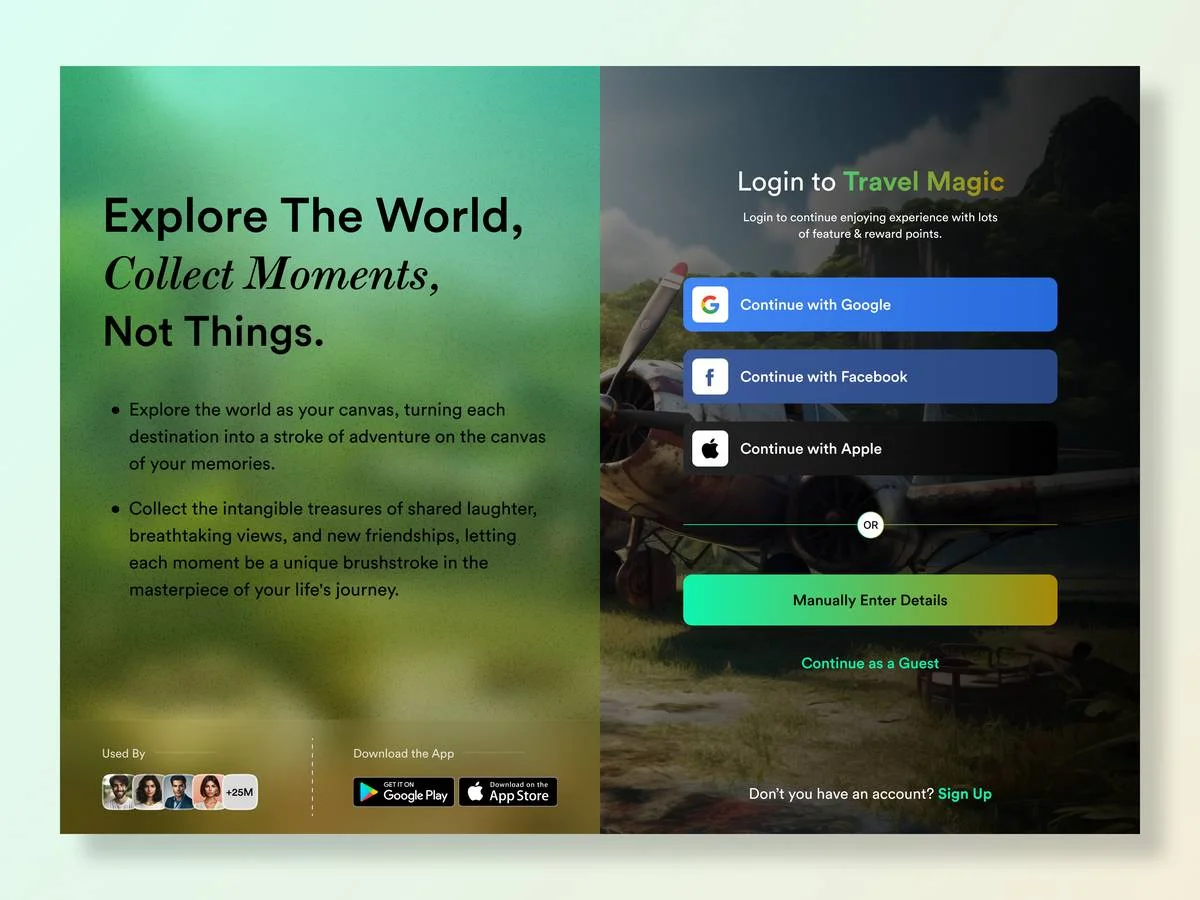
Glassmorphism is a 2025 design trend that many companies will use even in 2026. It has a see-through input field and a blurred background.
Adobe’s login form is an excellent example of the glassmorphism effect:

This example showcases a minimalistic login form maintaining simplicity. Very beautiful, nothing redundant.
This kind of design on login forms helps to:
- Improve readability
- Sign in quickly
- Create a professional feeling
Example 7. eCommerce Product Card

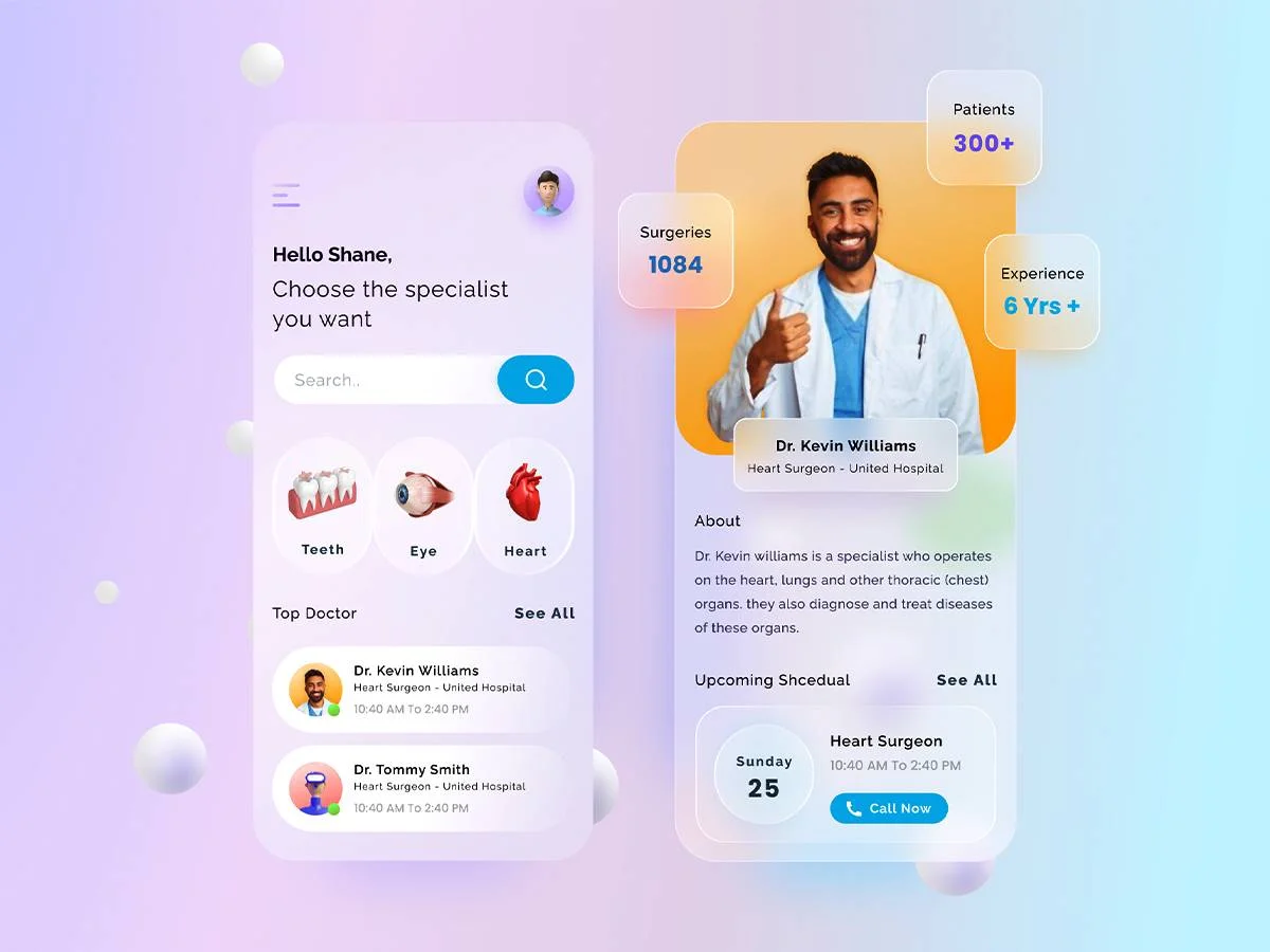
Product cards showcase the product image in a bit modern way.
Plus, the panels display user information while maintaining a glass-like appearance.
Glassmorphism design trend:
- Enhances product presentation
- Improves interactivity
- Improves conversion rate
Example 8. Messaging App
Transparent chat bubbles and a blurred background. The frosted glass effect adds depth to the chat interface.
It makes messaging apps:
- Look better
- Increase user interaction
- Make conversations more engaging
Example 9. Crypto Landing Pages
Crypto websites are one of the most famous places you can meet glassmorphism.
As an example let’s have a look at Robin Hood‘s platform below:

Blurry background and elements provide a high-tech and premium look to its trading interface.
As for crypto websites, it really creates:
- Elegance
- Professionalism
- Attractiveness
Example 10. Photographic Content
The last example I would like to mention is the photo gallery or photos used aligned with the blurry glassmorphism effect. You can face see-through image thumbnails and a blurred background.
And Reflect’s homepage visuals are a great example of a real live website using this cool effect.

Above all, this combination:
- Creates a blurry glass effect
- Helps better see the images
- Creates a calm UI
What is Glassmorphism: Definition & Concept – Quick Overview
Glassmorphism is a design technique that creates a glass-like appearance using see-through elements. These elements blur and use light and shadow.
It aims to mimic frosted glass and adds depth and dimension to the design. Glassmorphism makes background elements visible through glass-like surfaces. This creates a nice effect.
Glassmorphism focuses on minimalism and simplicity, focusing on clean lines and subtle gradients.
Also, it often uses a frosted or blurred background. This adds realism to the design.
The use of light and shadow is vital in achieving the glass-like effect.
Is the Glassmorphism Trend to Stay in 2026?
As with any design trend, the longevity of glassmorphism is uncertain.
It has become popular in recent years – but design trends are always changing.
However, glassmorphism will still be trendy in 2026 since it’s focused on minimalism, simplicity, and visual attractiveness. This focus makes it likely to stay popular in design for the near future.
Designers should not just rely on trends. They should instead focus on creating timeless and user-centric designs.
Glassmorphism can be a valuable addition to a designer’s toolkit.
However, it should be used carefully and in a way that fits the brand and user expectations.
How to Implement Glassmorphism in Your Design Projects
Implementing glassmorphism in your design projects requires careful consideration and attention to detail. Here are some key steps to follow:
- Choose the right elements: Find the elements that can benefit from a glass-like look. These include buttons, cards, and panels.
- Add transparency: Adjust the transparency of the elements to create a translucent effect. Experiment with different opacity levels to achieve the desired glass-like appearance.
- Blur the background: Apply a blur effect to the background to create depth and add realism to the design. The amount of blur can depend on the desired effect.
- Play with light and shadow: Strategically place light sources and shadows to create a three-dimensional illusion. This will enhance the glass-like effect and make the design visually appealing.
Tools to Create Glassmorphism in UI
You can use many tools and resources to add a glassmorphism effect to your designs.
Here are some popular options:
- Figma: Figma is a powerful design tool. It lets you create glassmorphism effects easily. It offers a wide range of features and plugins to enhance your design workflow.
- Adobe XD: Adobe XD has extensive support for creating glassmorphism effects. It offers a range of vector editing tools and plugins to streamline your design process.
- Canva: Canva is one of the best tools to create Glassmorphism in UI. It offers many pre-designed glassmorphism templates.
- CSS Frameworks: Many CSS frameworks such as Bootstrap and Tailwind CSS, have built-in glassmorphism support. These frameworks provide ready-to-use components and styles. You can easily change them to get the glass-like effect you want.
Create an Impressive Website With Onyx8
Glassmorphism is a striking design technique and has a huge impact on your website’s conversion rate.
If you want an impressive website with translucent elements, blurring, and light and shadow effects, Onyx8‘s web design experts are here to help you.
As a professional website design company, we provide the following solutions to give you a better user experience:
- Custom website design;
- Website redesign services;
- Custom web development;
- eCommerce web design & development;
- End-to-End SEO services.
When choosing Onyx8 as your web design partner, you will get:
- Project ownership
- Total transparency
- Measurable results
Contact us now to get a Free consultation and create a website that will impress your audience.


